Tuesday, April 26, 2011

Blog Post (a little late, a little content)

Daft Punk Coke!

Saw these a while ago, meant to post something about it.  I guess Tron 2: Tron Harder reinvigorated people's interest in the band, so Coke figured it'd be cool to make special edition bottles in commemoration of them?  I thought it was interesting just because Coke has such consistent branding (what, with the coke red and the swish and all), and I can't recall a time when they deviated so starkly from it.  Now that March has come and gone, I woulda hoped I'd have seen these in stores, but I'm not too bothered about it.

http://hypebeast.com/2011/02/daft-punk-x-coca-cola-club-coke-limited-edition-bottles/

Still waiting on Justice Mountain Dew though.

Tuesday, March 15, 2011

Poster comps

Just the images.  No text yet. The movies are part of a Terrence Malick festival


This one's The Thin Red Line.  It's a war movie.


This is Days of Heaven.  It's about sharecroppers and Richard Gere. Locust make a cameo too.


This is for Badlands.  It's about young lovers who go on a killing spree.  Martin Sheen combs his hair like James Dean.


Wednesday, March 2, 2011

Movie Poster Research


The first two links are a poster series by designer Olly Moss.  Link one has a bunch of posters he did for a recent event where movies were screened in the cities they were filmed (eg Detroit for Robocop and Philly for Rocky) and the second link are the poster designs he did that got him in the spotlight.  I've always liked these, but for breadth's sake, I'm posting other posters too.

http://www.ollymoss.com/roadshow.html 
http://www.ollymoss.com/films.htm


Tuesday, February 22, 2011

This is a blog post about orange and blue


http://www.slashfilm.com/orangeblue-contrast-in-movie-posters/
It’s becoming a rather noticeable trend in  key art, the orange and blue color scheme.  Not too surprising –it’s a good looking color combo, being complimentary and all– but once you notice it, it’s certainly interesting, if not a little cliché.

Tuesday, February 15, 2011

logo revision (holy cr*p you could tell what it is now!)

Olympic collateral (minus the business cards because I'm really dumb)

Dir1: The idea is that this version'll be printed on papyrus, as a sort of reference to the papyrus used in ancient Egypt.  The texture of the paper was a little dark though, so I lightened it up a little,  it *might* be hard to see on the screen as a result.
  
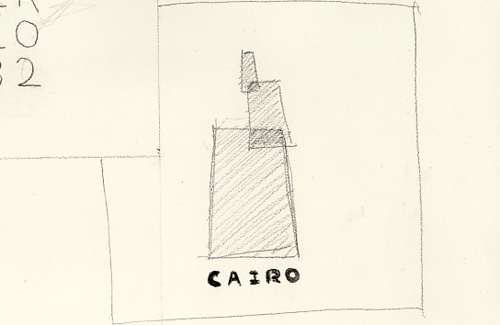
Dir2: This is just a design utilizing all the Pantones of the logo, with a baseline under the obelisk to form a sort of ground level that the obelisk would be sitting on. 


Dir3: This direction is meant to be pretty minimal.  I didn't want anything competing with the logo done in GOLD LEAF(!!!) (but really I think it's just a foil).  I have no idea how to print this, but I know Vanity Fair did it in their Oscar edition so I know it's doable en masse.

Thursday, February 3, 2011

Single color Cairo Olypmic logo roughs/ tracing exercises

tracing exercises: http://www.megaupload.com/?d=CQ4Q83I9

and I did some motion homework too I guess: http://www.youtube.com/watch?v=85r1fe14NZg

Tuesday, February 1, 2011

Cairo Olympic Thumbnails

In case it wasn’t clear from the title, I’m doing the 2032 Olympics in Cairo.
I tried focusing on various aspects of Egyptian culture, from the obvious (pyramids, winged discs) to the forgotten (the crescent of the Kingdom of Egypt, the long-gone Great Lighthouse of Alexandria) to aspects of Egyptian culture not as obvious as say, a Sphinx (with mosque domes forming a sort of “brain,” as the largest university in Cairo is the second oldest in the world, to an abstraction of a one of the largest hotels in Cairo, a reference to it’s sprawling urbanization).

I couldn’t fit all 10 in one scan so here’s the last.

I have no idea how to use this site//this is my first blog post

It’s about fake Criterion covers.

As someone really into movies and design, it’s only natural I should like The Criterion Collection as much as I do.  If you don’t know, they’re video distribution company that focuses on older, foreign-er, art-ier movies (and Armageddon).  Their releases are always packed with commentaries and editorials and special features and all that good stuff, so you never have to feel bad when you’re shelling out the extra 15 dollars for one of their dvds (unless it’s Armageddon).  Even better, their covers are always really really cool– dope, even (not Armageddon though, not sure what happened there).
These are 10 good ones, as decided by someone else.  But to be fair, you could pick 10 random covers and come up with 10 good ones (unless you wound up getting Armageddon).

http://blog.cartelagency.com/2008/08/31/the-10-best-designed-criterion-collection-dvds/

Anyway, there’s a blog that features a bunch of user-submitted designs for Criterion Covers that don’t, and likely won’t, exist. Some of them are almost as bad as the movie itself, sure, but sometimes you find a gem

http://fakecriterions.tumblr.com/